HMBK – Thomas Hambeck
HMBK' is a brand with a strong identity for the tax consultant Thomas Hambeck, which is equally characterized by high expressiveness and personal character.
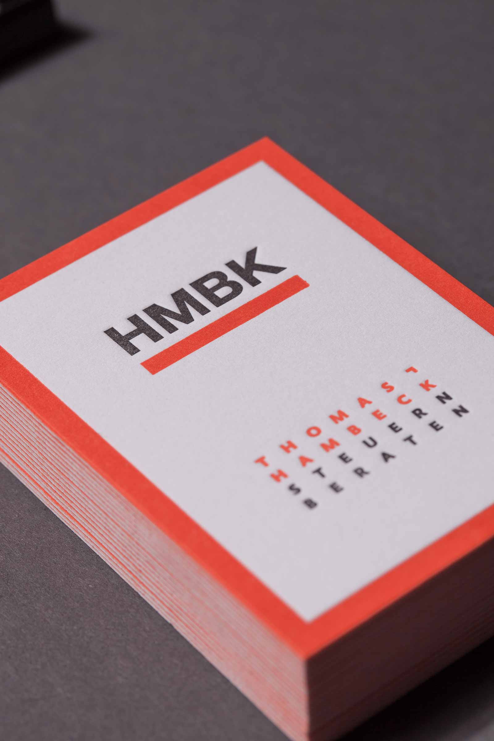
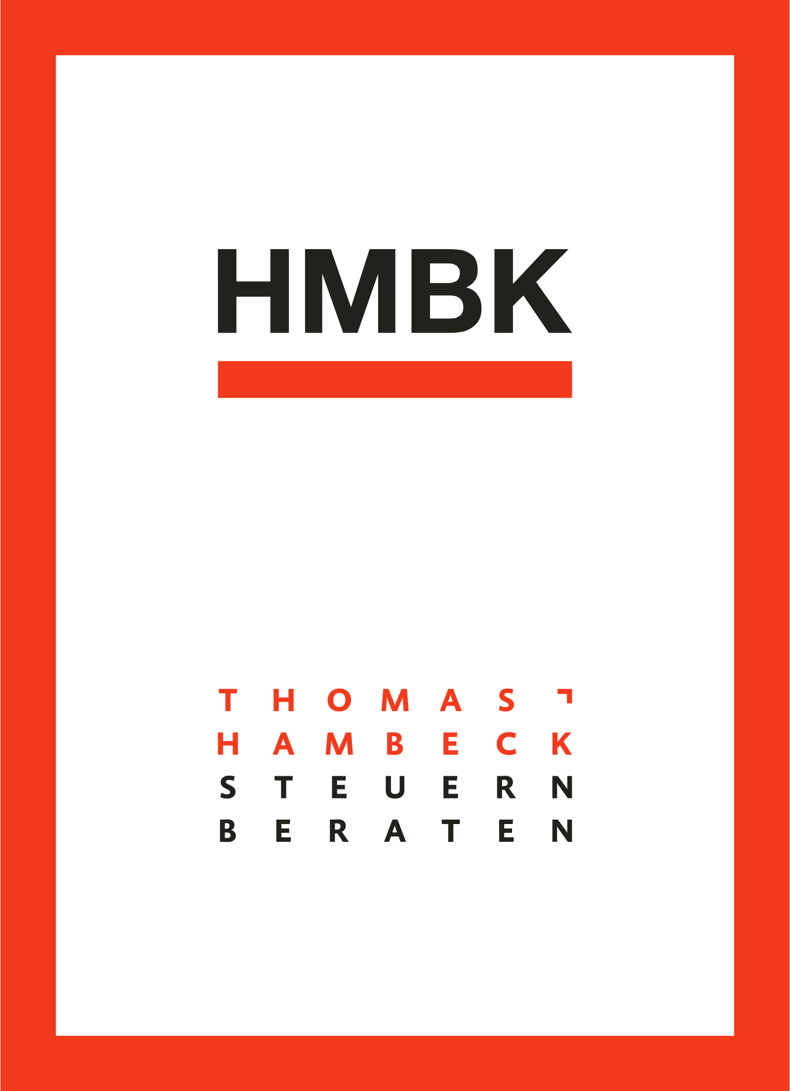
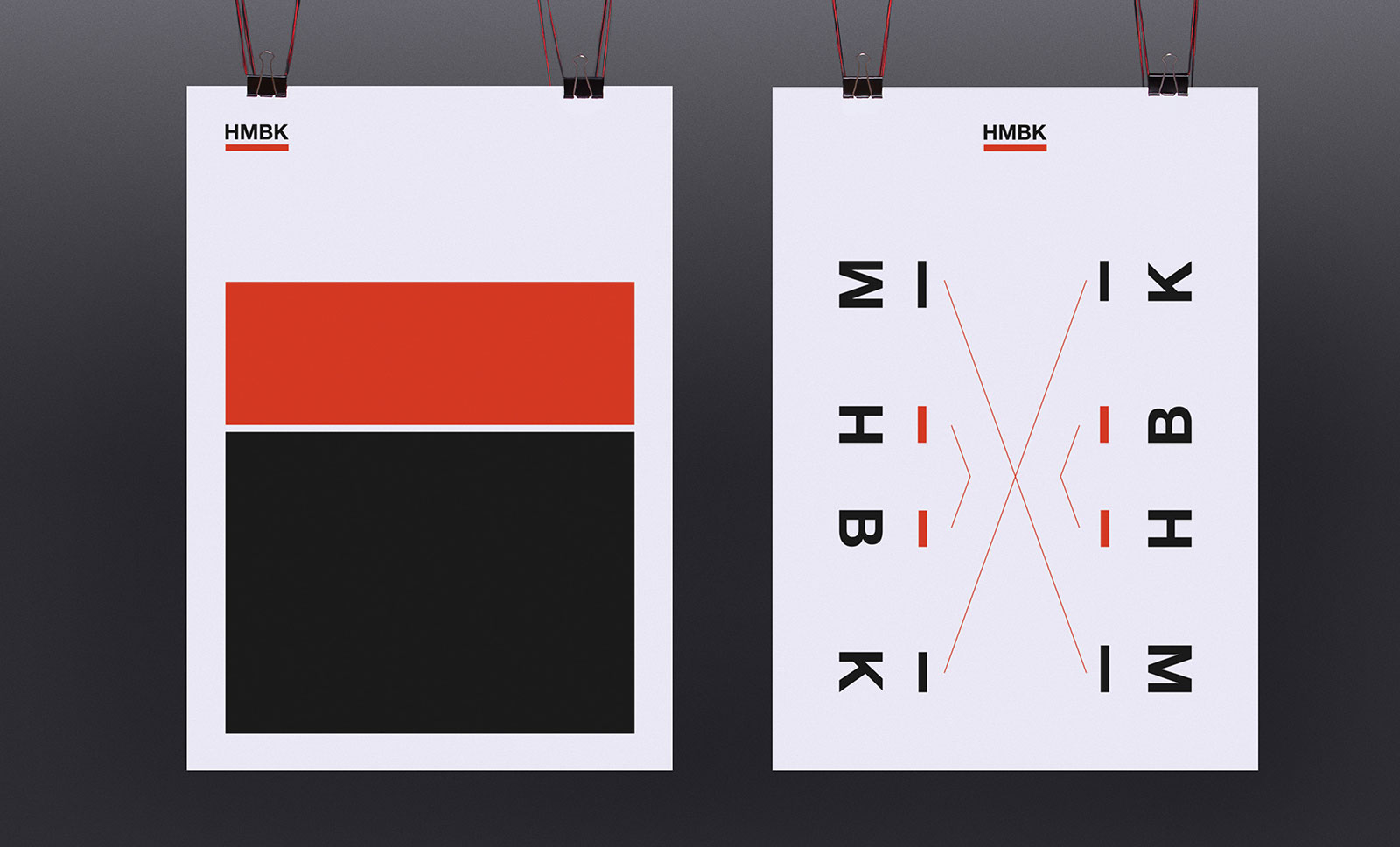
The vowels omitted in the condensed mark are phonetically completed again in the pronunciation of the individual letters, therefore these letters phonetically represent the name Hambeck. The logo refers to the characteristics of the work process: condensation, analysis, optimization. Formative reduction, a clearly contrasting color scheme with thematic reference and its application to the means of communication create an authentic appearance with clear differentiation.
CORPORATE DESIGN
CORPORATE IDENTITY
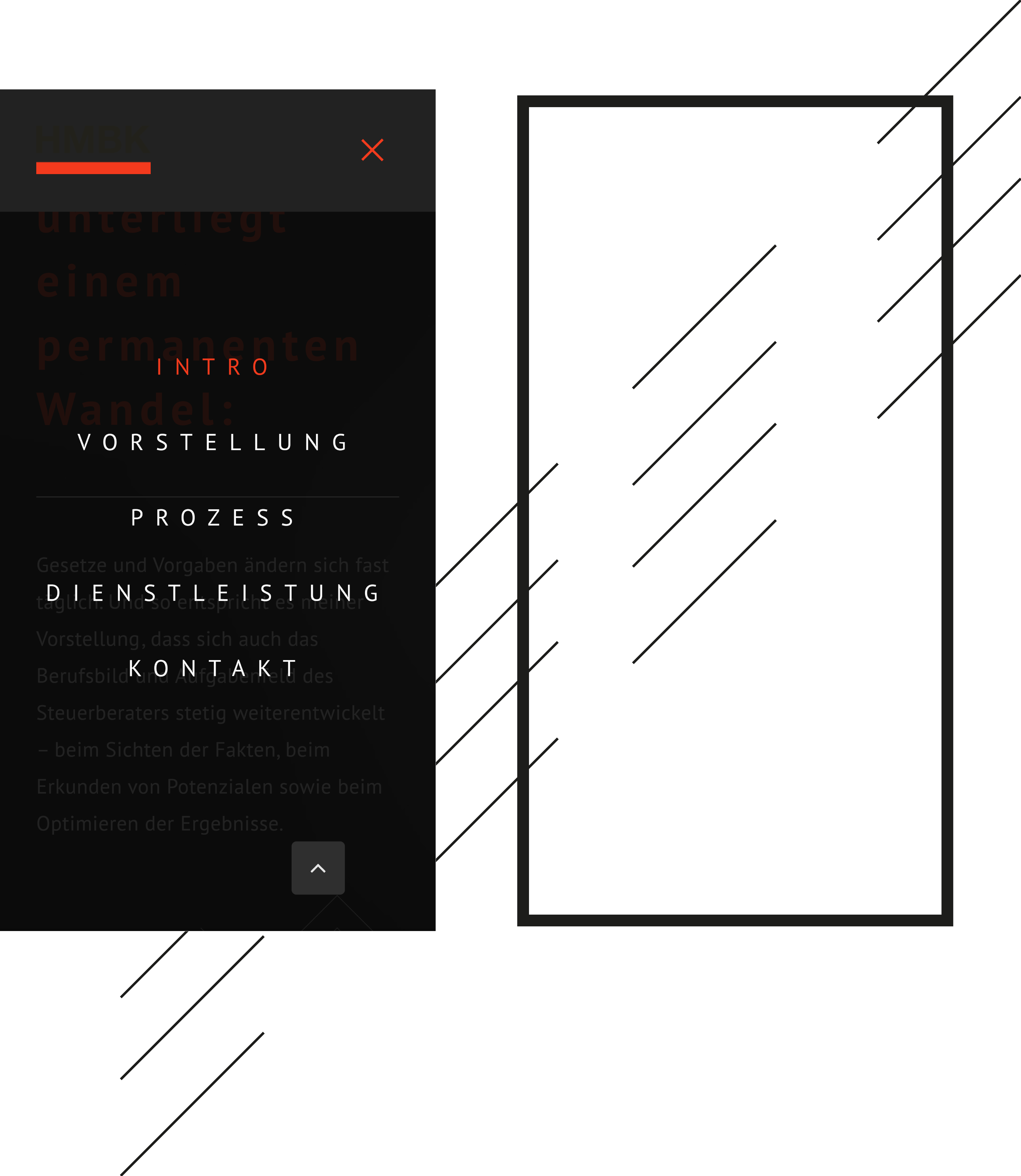
COMMUNICATIVE APPLICATION

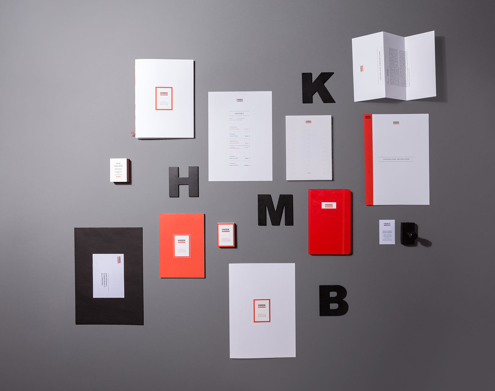

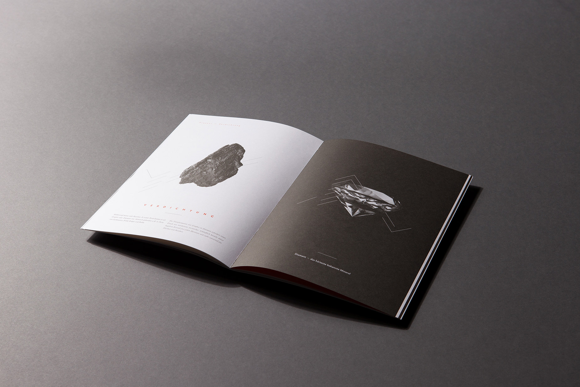
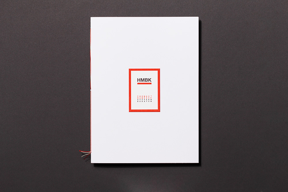


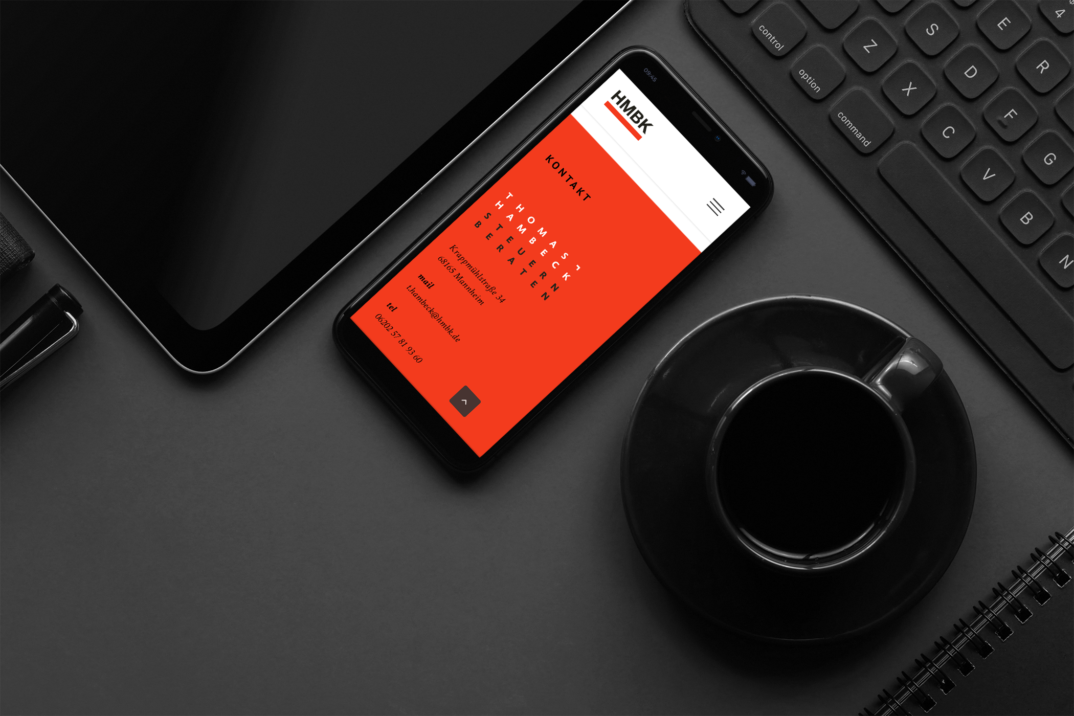
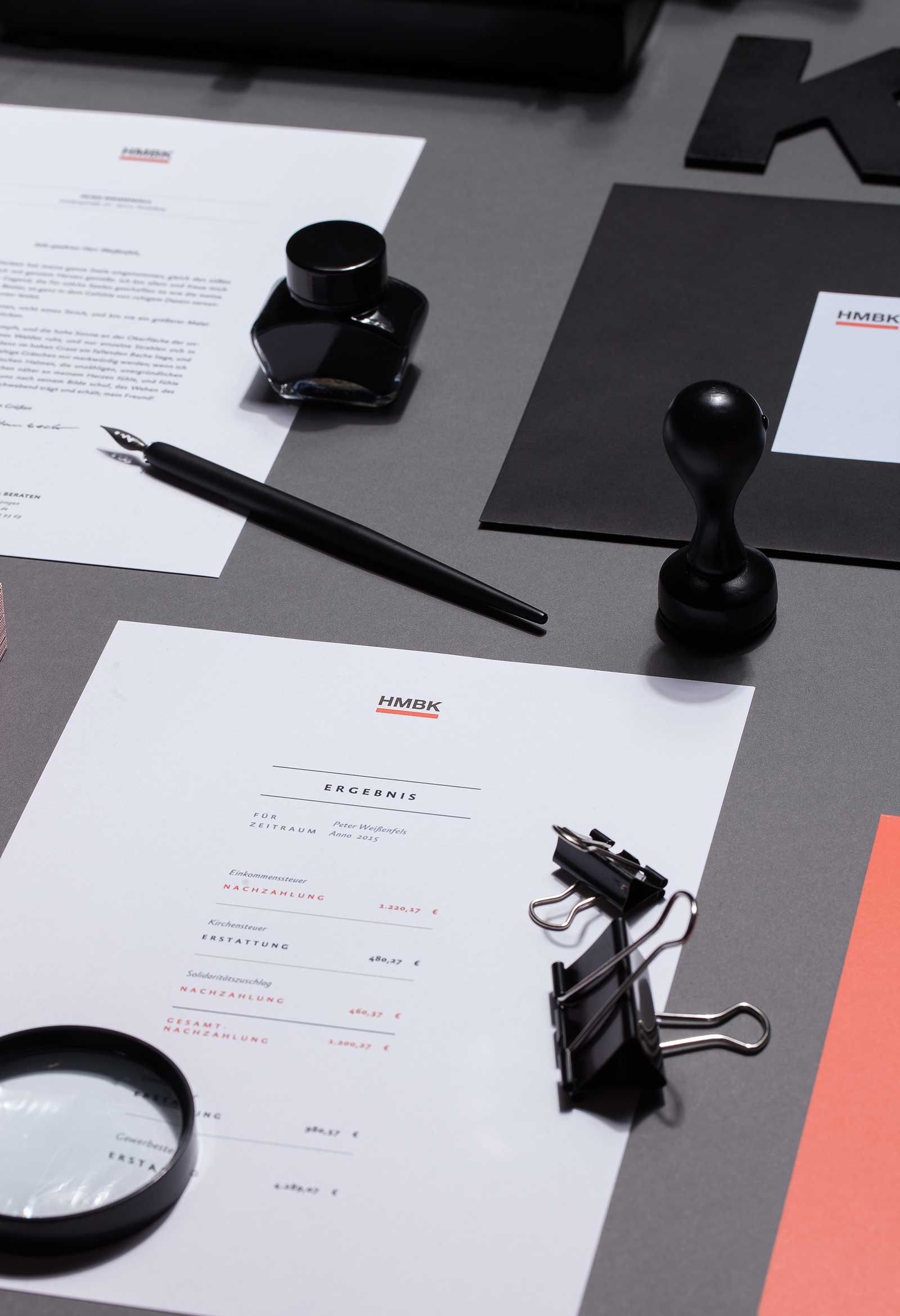

'Analysis', 'condensation', 'optimization' is the slogan that is implemented in a formative and concise manner, starting with the embossed business card with the linear red HMBK underlining and labeling and the red cadrage on sturdy cardboard. In addition, the brochure's strong cover with fine thread stitching translates the visual metaphors of the work philosophy into abstract-concrete typography. It is a graphically and formally extremely intellectual concept, which illustrates the meticulousness, exactness and correctness of the announced professionalism with reductionist and minimalist means. The HMBK brochure says: " In order for you to achieve the optimal in terms of tax payment and tax saving in the future, as well as to develop new projects in perspective." With this final sentence, the future design will not lag behind.
Jury Berliner Type Award