QIT Systeme
Long-term archives, dose management, image processing and management. These are just some of the topics in radiology that QIT Systeme handles every day as a specialized IT service provider. Their own claim is clear: to offer better solutions. More secure, more reliable, more personal, better integrated and always fair. Taking customer concerns seriously, always wanting to provide full performance for the client, that is what distinguishes the company and its founders and that is also what makes them so relevant for the sensitive environment of radiology, where failures immediately become expensive.
Our work for QIT starts right here, with corporate identity. Together, we reveal values, roles, mission, and many other content-related aspects, and create a transition into communicative assets, a messaging house, and core communication principles for presenting services. - #RANGE
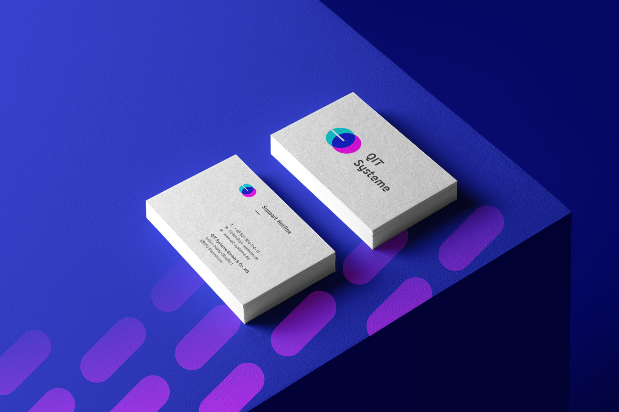
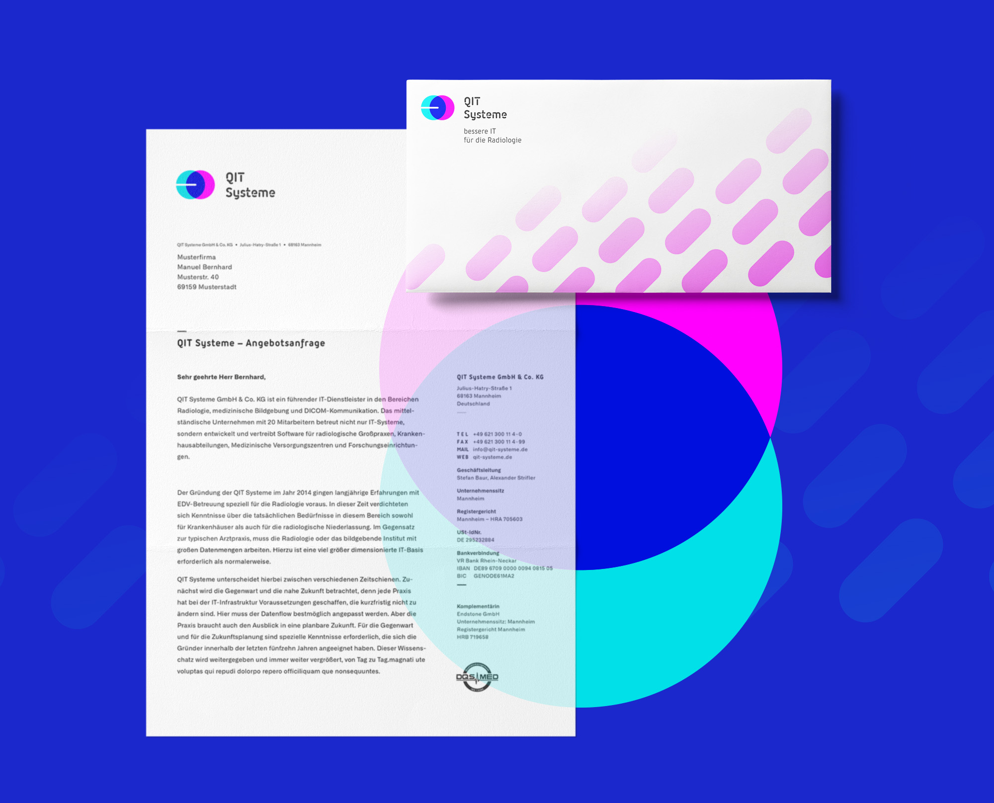
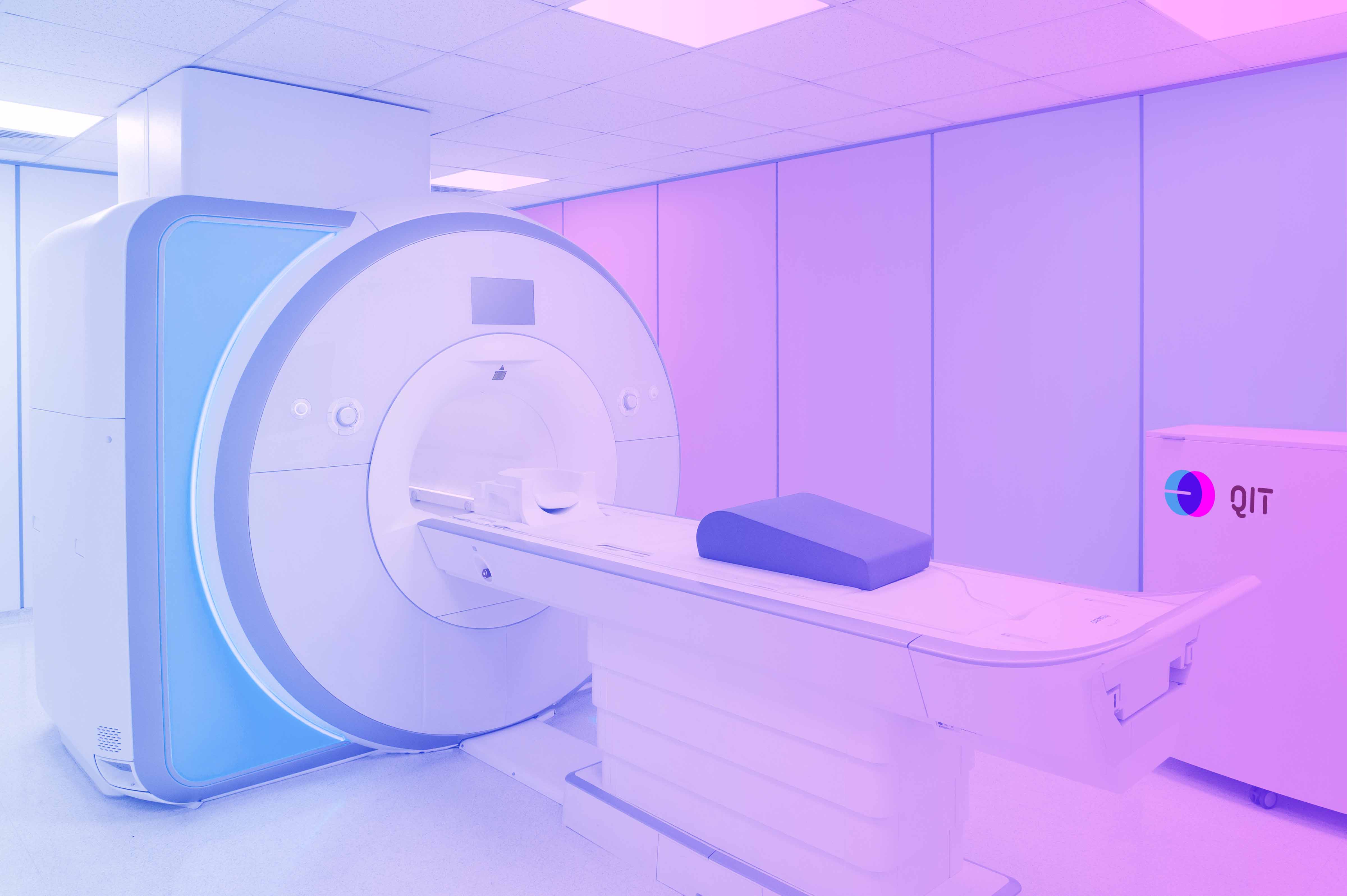
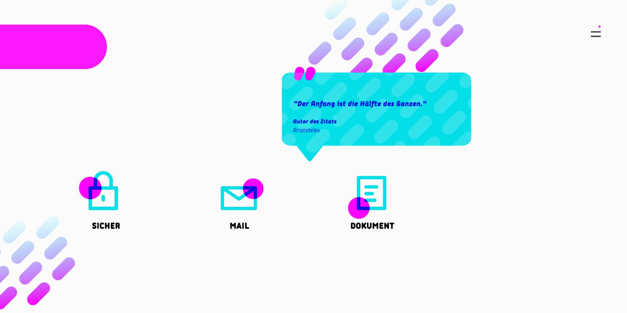
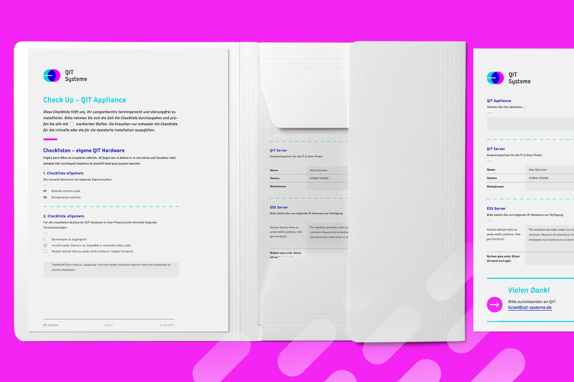
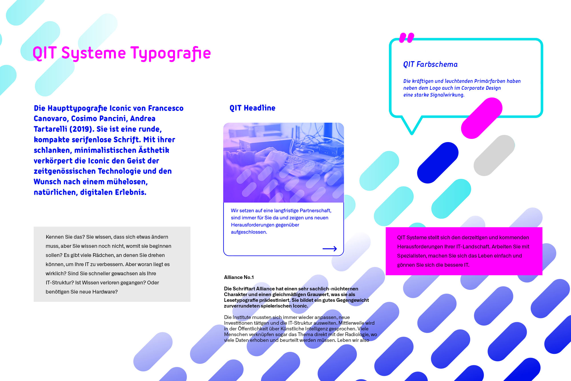
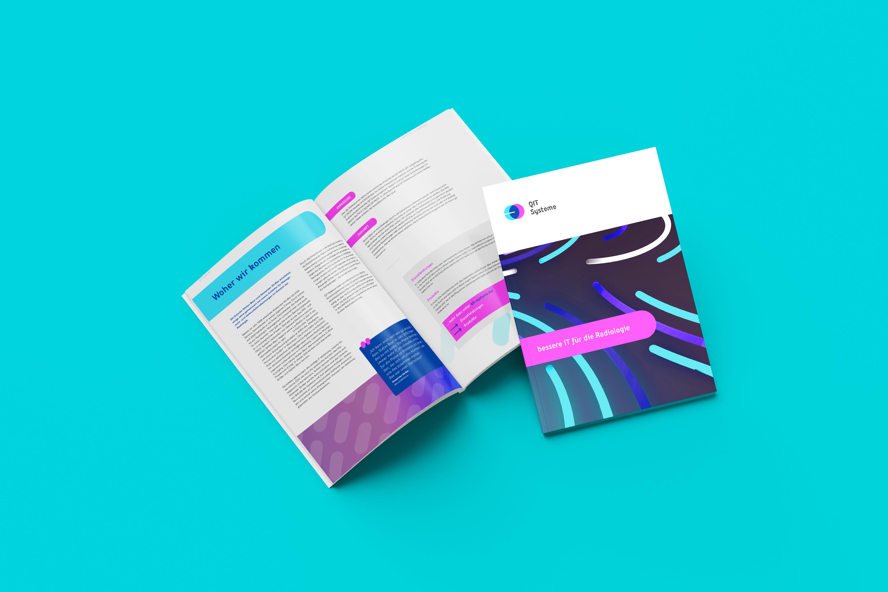
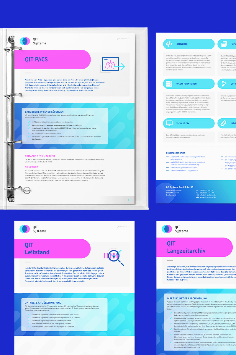
The corporate identity subsequently also finds a translation into the visual world. A progressive appearance, full of character, with a very particular color code inspired by basic technical principles of imaging. Soft, round, flowing yet factually clear graphic elements and typography that convey the supportive yet highly professional central claim: Better IT for Radiology.
Work
- Identity
- Brand Architecture
- Values
- Mission
- Vision
- Target Groups
- Design
- Visual Design System
- Annual Layer 2020
- Logo
- Section Logos
- Award Laurels
- Digital
- Screendesign
- Website
- Content Design
- Print
- Stationery
- Brochures
- Marketing Media